

Green-Screening
Using a green screen for stills is a sort of wonky proposition. Normally intended for video so as to make easy on-the-fly switching-out of the green for say, a weather map—in still photos that switch lacks urgency. You’ve got all the time in the world to ‘select out’ the background and fine tune the edges. But because you have time, and because you need it to look good for the odd pixel-peeper who will judge you harshly for sloppy amateurish Photoshop-ing, you gotta do it right. So the following is my contribution to the blog-o-sphere’s knowledge base. Feel free to call me out if there are better techniques.

First you get your green screen set up far enough behind your subject that it falls out of focus and presents in-photo as a continuous color. Lighting it in such a way as to balance with your primary flash is beyond the scope of this screed, but: not difficult. And what you get is green mixed into the edges of your subject. This is better than, say, black or white from a black or white background, because neutrals are everywhere in your subject and can’t be de-saturated ‘out’ like green can. But we’re getting ahead of ourselves.
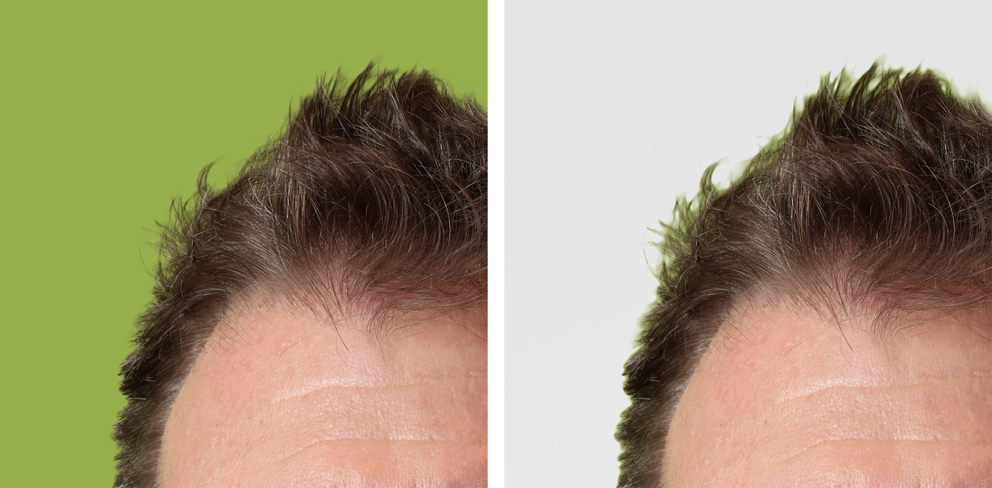
Once you’re in Photoshop, you select all the green using the ‘Color range…’ menu item. I set it for relatively low fuzziness and ‘pick’ several additive spots all around. Hit OK and clean up the selection using the quick mask Q button thingy and brush tool. (Apologies to Photoshop beginners for my glossing over important details…). Another thing I do is go into the ‘Select and Mask...’ menu and increase the ‘Smoothness’ (quite a bit) so as to reduce the crunchy pixelations you get with the select tool. Now create a layer mask of your selection using a pull down menu or the button in your layers panel. You’re still in the Background layer (or Layer 0) at this point so we need make a new layer of white—or in this case, a combination of white with various overlying gradients merged-in—and then drag your new mask from the Background layer onto it.
This gets you to what you see in the 2nd detail I’m showing: getting there, but not what we want. First reparation required is creation of a ‘Hue/Saturation…’ adjustment layer so that we can de-saturate the greenness away from our image’s selelection edge. Strangely it’s the yellow slider that gives you best results. Our guy at PiXimperfect has the best ever description of how to zero in on the color you want to adjust, so I’ll refer you to his excellent tutorials for more on this. Once you’re done you can ‘invert’ the mask created with this layer and then paint your correction back in where you need it. Doing so preserves all the colors where you do want them in the skin tones and clothing.
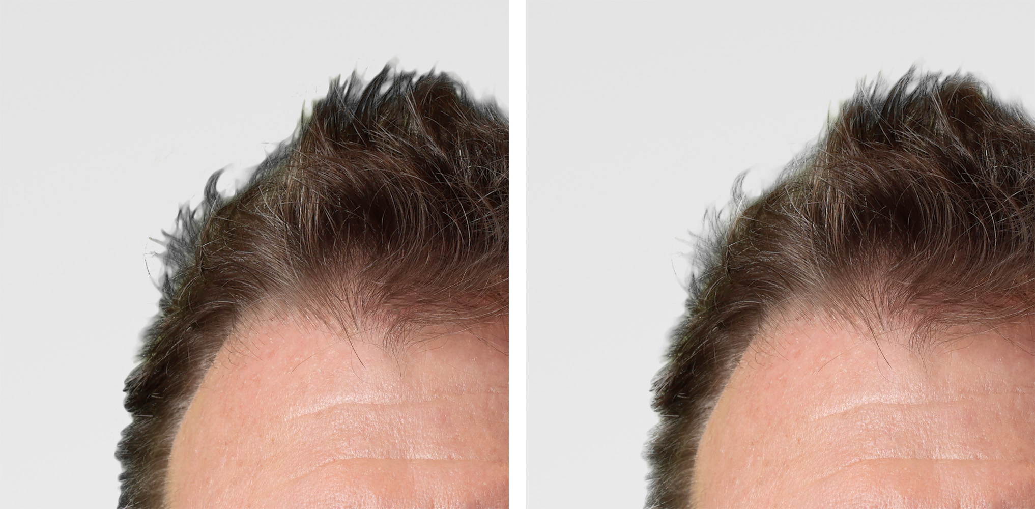
But now you’ve got a gray clumpy look instead of green clumpy (3rd detail). Create another adjustment layer beneath your new white-ish/mask layer and lighten the gray in such a way as to mostly eliminate it—in this case I use ‘Curves’. Invert this mask as above and paint in the lightening where required.

And Viola! You get (in the 4th detail and final image) a soft-ish, fade-y look reminiscent of what you’d see at f/1.2—which by the way I didn’t use in the original captures because f/1.2 gives you an out of focus, green mix that’s really tough to deal with satisfactorily—these mitigations geive you visible desaturation well into the image instead of the edges only. I used f/8 in all these in order to isolate fine detail as best I could.
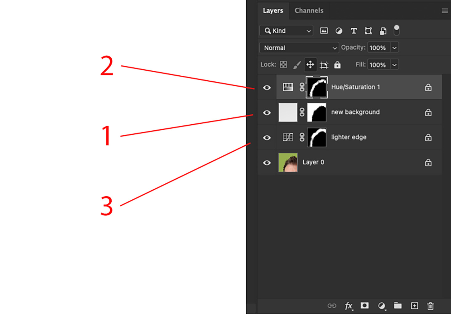
Last image is the resulting Layers panel showing all adjustments, numbered in order of their creation. If you squint you can see the white I painted into the otherwise blacked-out masks.
So there you have it! Hopefully this description will be of some use and not be just another lump in the ethers.
A